
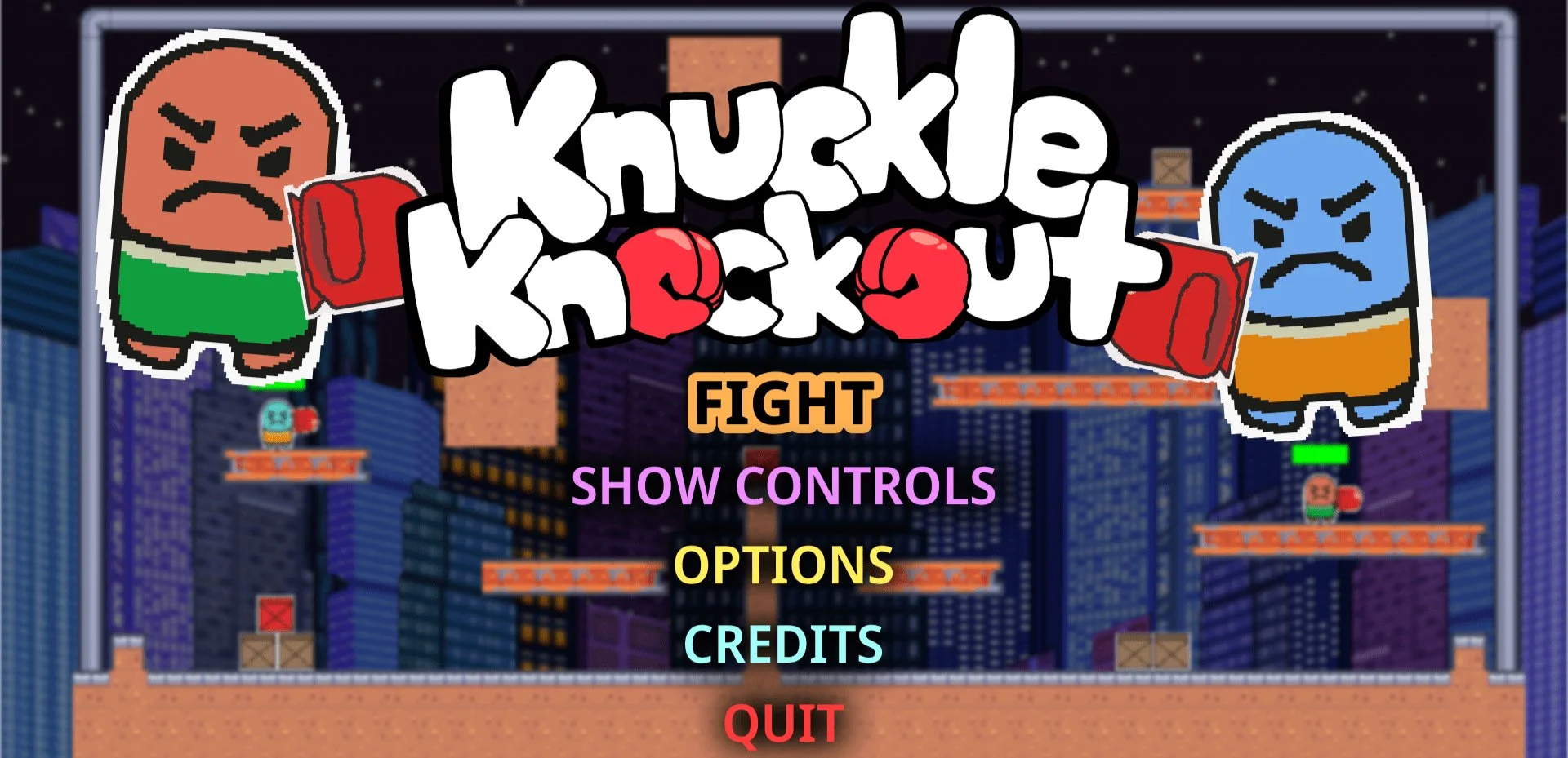
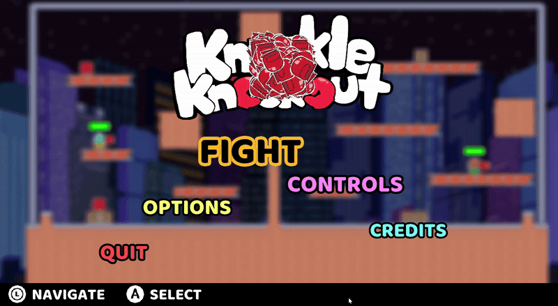
Knuckle Knockout
________ ✴ ________
Knuckle Knockout is a fast-paced Smash Bros inspired 2D platform fighter built in a custom engine.
×
I led UX design, focusing on responsive controls, impactful camera feedback, and dynamic visual cues to create a strong sense of game feel where every hit feels powerful.
×
I developed accessibility features like colorblind-safe palettes and OpenDyslexic font options to make the game both exciting and inclusive.
________ ✴ ________
Play Knuckle Knockout for free on Steam!
✦
Read more about Knuckle Knockout!
________ ✴ ________
Colorblindness
I conducted colorblindness testing to ensure our players could quickly and easily distinguish characters and environments. Using filters to simulate eight types of colorblindness, I adjusted palettes, added contrasting patterns, and refined outlines to improve clarity and readability. The result was a visually distinct experience that maintained the game’s artistic style while remaining accessible and inclusive.
✦
Process
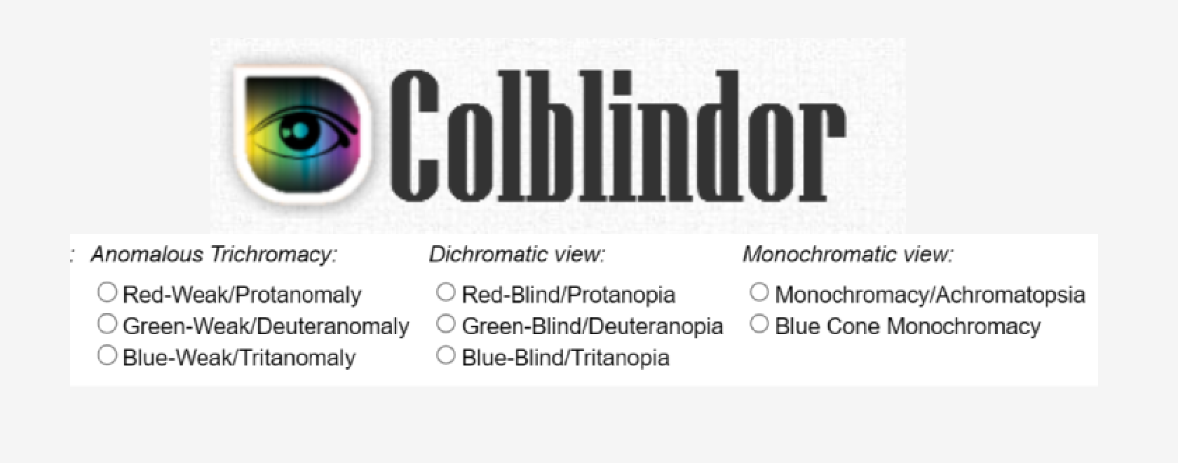
Colbliner, the color blindness filtering tool
【How could color communicate gameplay-critical information and account for colorblindness?】
×
Defined color as a readability system by identifying critical elements; characters, environments, and hazards. Ensuring they remained distinguishable through contrast, patterning, and value rather than color alone, while maintaining the game’s grounded visual tone.
________ ✴ ________
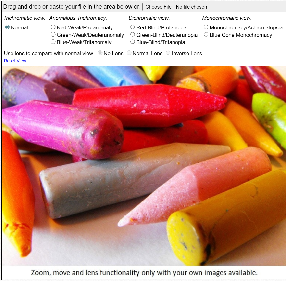
8 spectrums of color blindness
【How could accessibility decisions be validated in gameplay combat scenarios?】
×
Tested gameplay using filters simulating eight types of colorblindness across active combat scenarios. Collaborated with colorblind teammates and external testers to refine palettes, hue relationships, and saturation based on real-world readability feedback.
________ ✴ ________
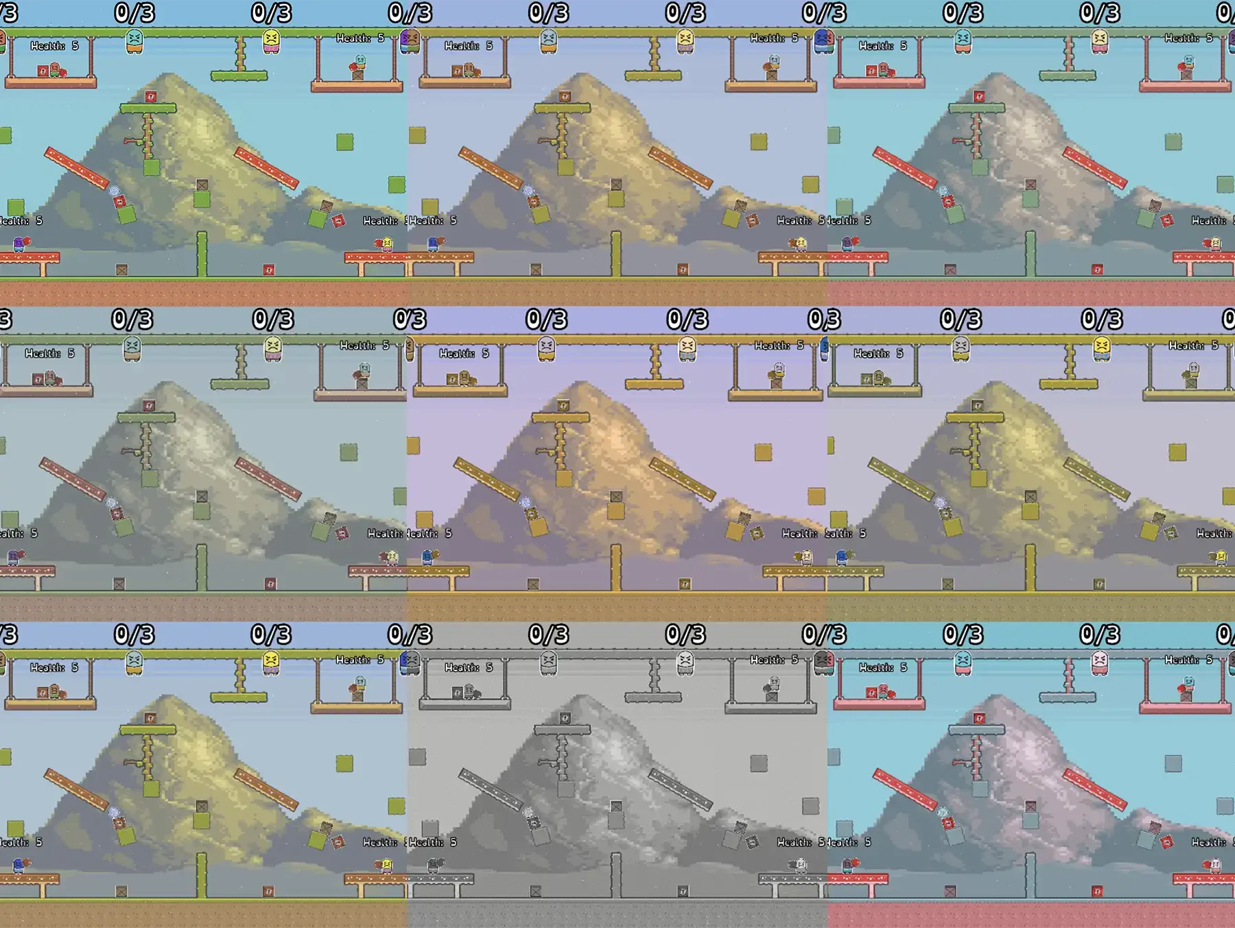
Colorblind spectrum testing with cohesive UI adjustments
【How could moment-to-moment readability be improved without adding visual noise?】
×
Iterated through playtesting to refine outlines, contrast levels, and pattern usage, improving instant recognition during combat while aligning every adjustment with the game’s art direction, pacing, and immersion goals.
________ ✴ ________
Font Choice
I selected Baloo as Knuckle Knockout’s primary UI font to match the game’s bold, rounded character design and express its playful, high-energy tone. Baloo’s soft curves and thick strokes visually tied the interface to the art direction, creating cohesion across menus and gameplay. Its clarity and legibility supported fast-paced readability, while the toggleable OpenDyslexic option ensured style and inclusivity worked together to enhance the overall experience.
✦
Process
The game’s intended font style, Baloo (main menu)
【How could UI typography reinforce the game’s personality and visual identity?】
×
Evaluated typefaces for shape, weight, and tone, selecting Baloo for its rounded forms and bold strokes that visually aligned with character design and reinforced the game’s playful, energetic aesthetic.
________ ✴ ________
The game’s intended font style, Baloo (pause menu)
【How could player preference and readability be validated quickly?】
×
Conducted rapid print-based font tests to gather qualitative feedback on readability and tone, identifying Baloo as the most recognizable, readable, and stylistically fitting option among players.
________ ✴ ________
The game’s intended font style, Baloo (gameplay)
【How could readability be prioritized without excluding accessibility needs?】
×
Verified Baloo’s clarity for fast-paced gameplay while supporting a toggleable OpenDyslexic option, ensuring players could choose increased readability without compromising the game’s visual cohesion or tone.
________ ✴ ________
Dyslexia
I led the implementation of OpenDyslexic in Knuckle Knockout to improve menu and text readability for players with dyslexia. After identifying readability barriers, I proposed the feature, integrated the font across UI elements, and refined spacing and layout through playtesting to ensure its weighted baselines and distinct letterforms improved comprehension while remaining consistent with the game’s visual style.
✦
Process
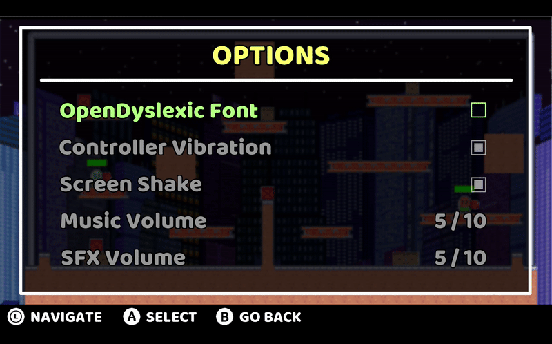
OpenDyslexic toggle in options
【How could menu typography reduce reading friction for players with dyslexia?】
×
Identified readability barriers in existing UI text and proposed OpenDyslexic as an accessibility feature, selecting it for its weighted baselines and distinct letterforms that reduce letter swapping and improve word recognition.
________ ✴ ________

Fitting accessible font with game aesthetic
【How could accessibility be introduced without disrupting the game’s visual identity?】
×
Integrated OpenDyslexic across menus and text elements, refining sizing and hierarchy to maintain readability while matching the game’s tone, and reinforcing the font’s fit through public playtesting.
________ ✴ ________
Validating alternative font within UI context
【How could a secondary accessibility font be implemented without disrupting existing UI structure?】
×
Implemented the UX of OpenDyslexic by integrating it into existing menu layouts without restructuring UI components, refining spacing, alignment, and hierarchy so accessibility improvements did not disrupt established interface behavior.
________ ✴ ________
Credits Menu
I designed Knuckle Knockout’s credits menu to reflect the game’s world and energy, avoiding a detached, static list. Each developer’s name and role appeared on in-game elements like platforms and stage props, keeping the experience visually grounded in the environments players had just fought in. The result was a playful, high-energy credits scene that celebrated the team while staying consistent with the game’s tone and visual language.
✦
Process
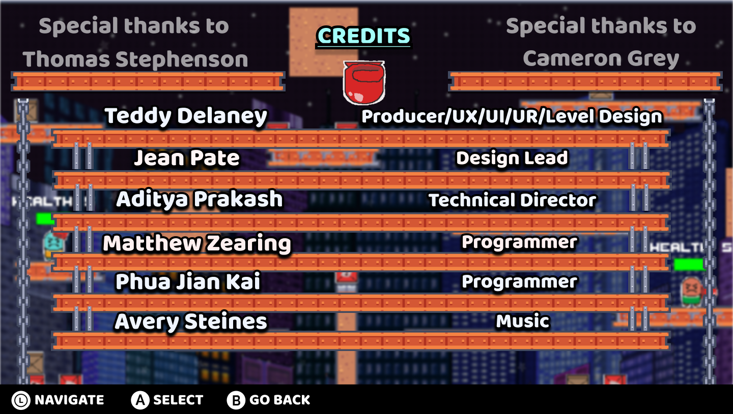
Idealized credits menu
【How could the credits menu preserve immersion instead of creating a gameplay break?】
×
Avoided a traditional credits overlay by integrating names and roles directly into the playspace, allowing players to remain visually and contextually anchored in the game’s environment rather than shifting into a detached UI state.
________ ✴ ________
Level assets used to dress up credits menu
【How could a static credits screen feel like it belongs within the game’s world?】
×
Designed the credits using in-world props and spatial framing drawn from gameplay environments, placing names and roles on familiar stage elements so the screen felt embedded in the game’s world rather than presented as a detached UI layer.
________ ✴ ________
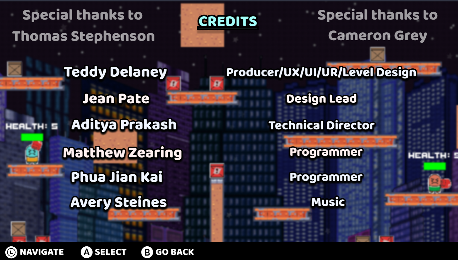
Prototyped credits menu
【How could the credits celebrate the team and game while maintaining visual cohesion?】
×
Aligned typography, composition, and presentation with the game’s established visual language, framing each contributor as part of the world and reinforcing a sense of shared team identity within gamespace.
________ ✴ ________
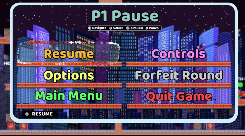
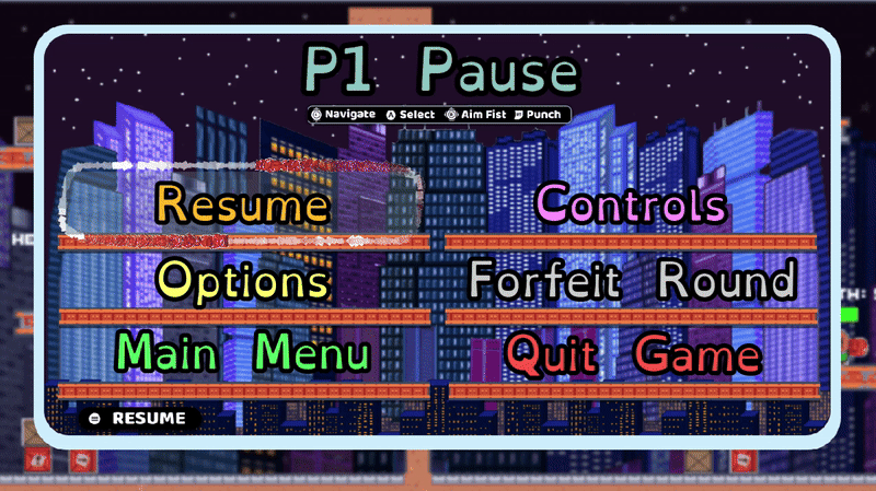
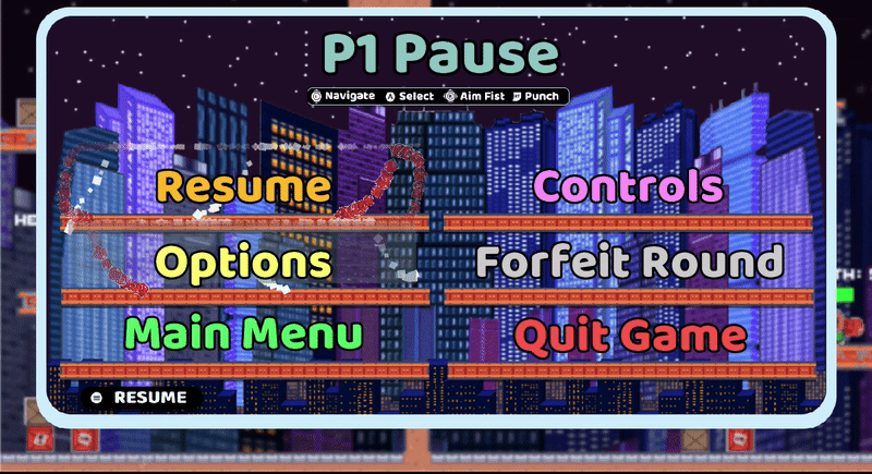
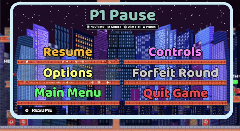
Pause Menu
I redesigned Knuckle Knockout’spause menu to reduce overstimulation and improve player comfort during intense matches. Early iterations combined bright colors, heavy motion, and fast transitions that overwhelmed players. Through iterative testing and visual refinement, I created a cleaner, calmer interface that preserved the game’s playful tone without pulling players out of the experience.
✦
Process
Prototyped animated selection border
【How could players pause without the experience feeling visually dead or disconnected?】
×
Designed the pause menu to retain controlled visual stimulation by using colorful UI elements and a background tied to the game world, allowing players to remain visually engaged while gameplay was halted.
________ ✴ ________
Dynamic particle movement between selections
【How could focus be maintained without introducing visual overload?】
×
Added a restrained animated border around the currently highlighted option, providing clear focus and feedback without introducing competing motion or excessive effects.
________ ✴ ________
Immediate pause menu mirrors level to maintain immersion
【How could the pause menu balance energy with comfort?】
×
Refined color intensity, animation speed, and contrast through playtesting to ensure the menu felt lively and readable while remaining calm enough for decision-making during intense matches.
________ ✴ ________
Screen Shake
I refined Knuckle Knockout’sscreen shake system to balance impact, clarity, and player comfort. Early implementations risked motion sickness and visual fatigue due to overly aggressive camera movement. By iterating on shake intensity, duration, and direction through repeated playtesting, I calibrated feedback so punches, collisions, and stage hazards felt powerful and energetic while remaining controlled, readable, and comfortable.
✦
Process

Screen shake on impact
【How could screen shake enhance impact without causing motion sickness or fatigue?】
×
Identified excessive shake strength and duration as primary contributors to discomfort, establishing comfort thresholds as a core constraint for all camera feedback.
________ ✴ ________
Variable screen shake based on interaction
【How could shake values be tuned to match gameplay rhythm and context?】
×
Tuned intensity, duration, and directional bias in our team’s custom engine, adjusting values per interaction type so punches, hazards, and collisions reinforced impact without overwhelming the player.
________ ✴ ________
Death and respawn screen shake
【How could the final balance be validated across different players and scenarios?】
×
Iterated through playtesting and player feedback, refining shake behavior to ensure each instance felt responsive and satisfying while maintaining clarity and control during fast-paced combat.
________ ✴ ________
Motion Sickness
I refined Knuckle Knockout’s player controller through extensive user testing to balance high-impact excitement with player comfort. Early builds caused motion sickness and overstimulation due to excessive screen shake and rapid feedback. By iterating on camera motion, impact timing, and visual effects, I preserved the game’s energetic “rattling” feel while ensuring players could sustain fast-paced play without discomfort or sensory overload.
✦
Process
Reduced screen shake for platforming
【How could screen shake be made optional to reduce motion sickness without reducing the game’s feel?】
×
Recognized screen shake as a key contributor to motion sickness and added a configurable toggle that let players control camera shake independently, ensuring comfort adjustments did not alter game pacing or feedback clarity through consistent playtesting.
________ ✴ ________
Diegetic health representation
【How could motion sickness be assessed and measured during playtesting?】
×
Collected structured player feedback during playtests, documenting reports of nausea, disorientation, and visual fatigue, then correlated those responses with specific camera behaviors and feedback moments to guide targeted adjustments.
________ ✴ ________
Reduced screen shake for combat
【How could default camera motion and impact timing be preserved once screen shake became optional?】
×
Refined hit timing, camera easing, and motion curves so the base experience retained its kinetic “rattle” even when comfort settings were introduced. This energy was preserved through dynamic camera zoom that subtly adjusted based on player positioning across the map, creating emergent impact without relying on shake.
________ ✴ ________
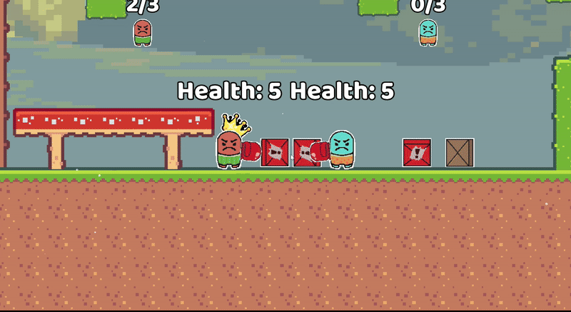
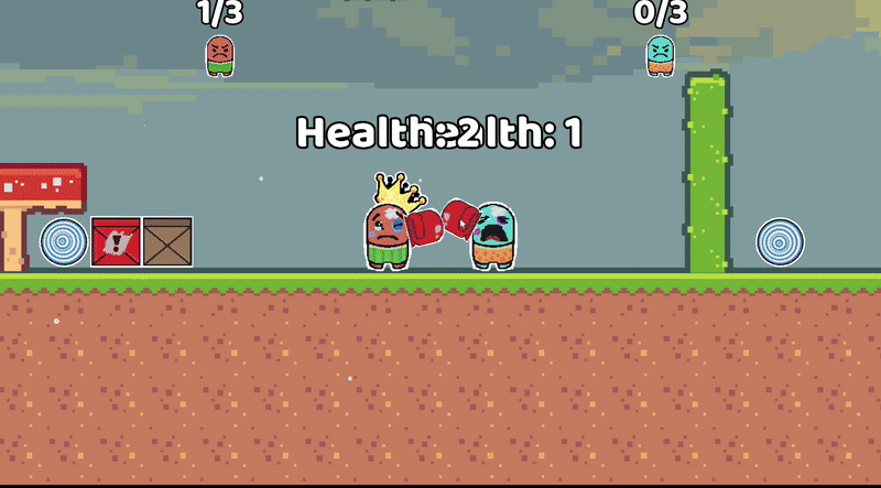
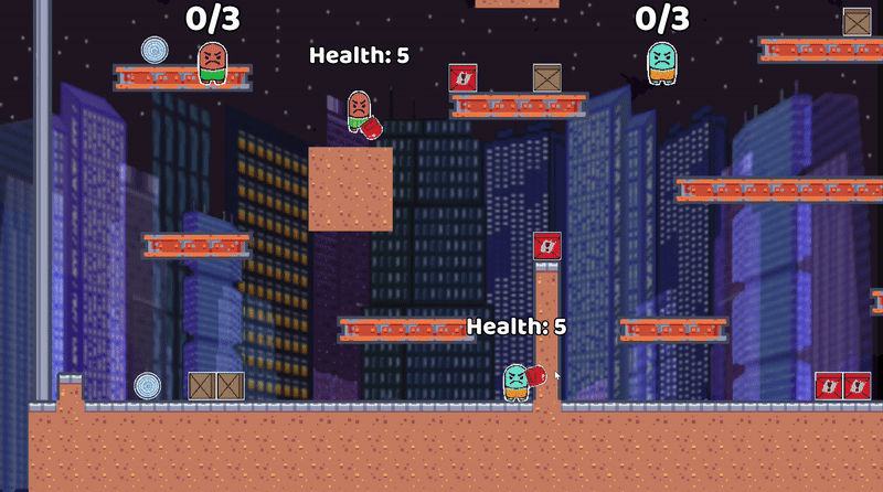
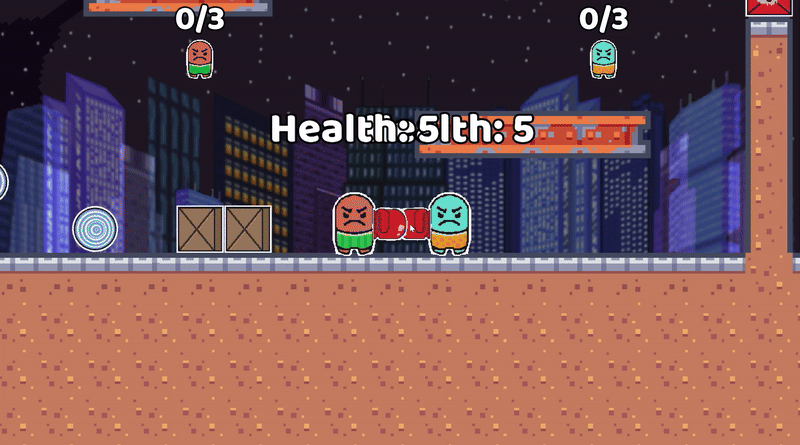
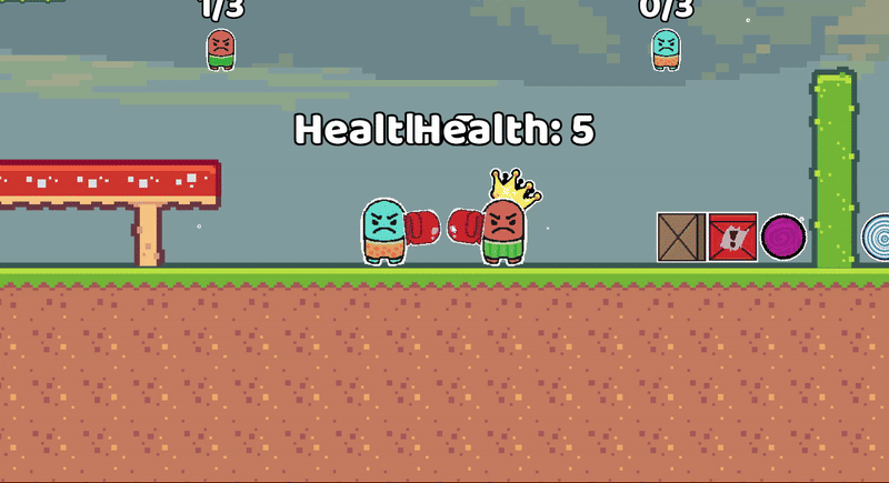
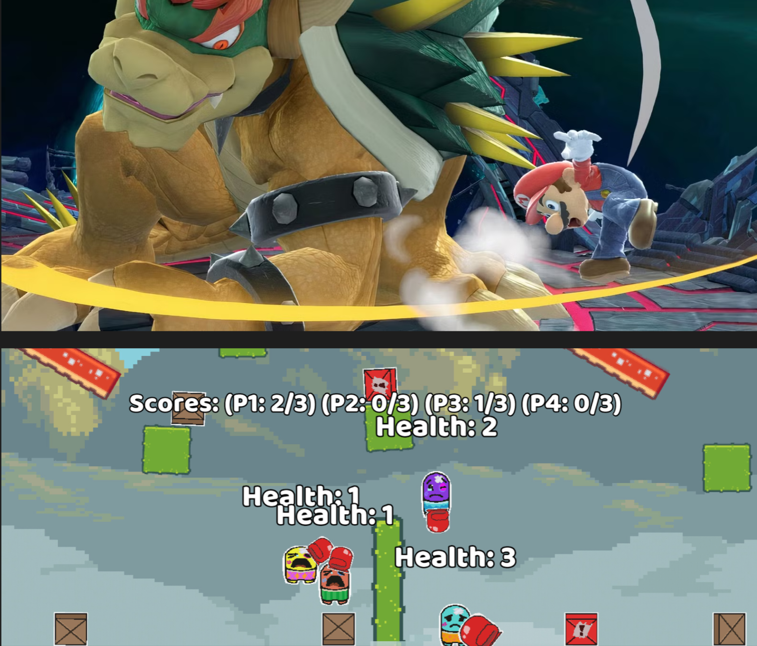
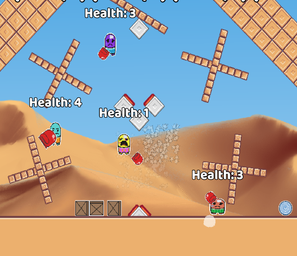
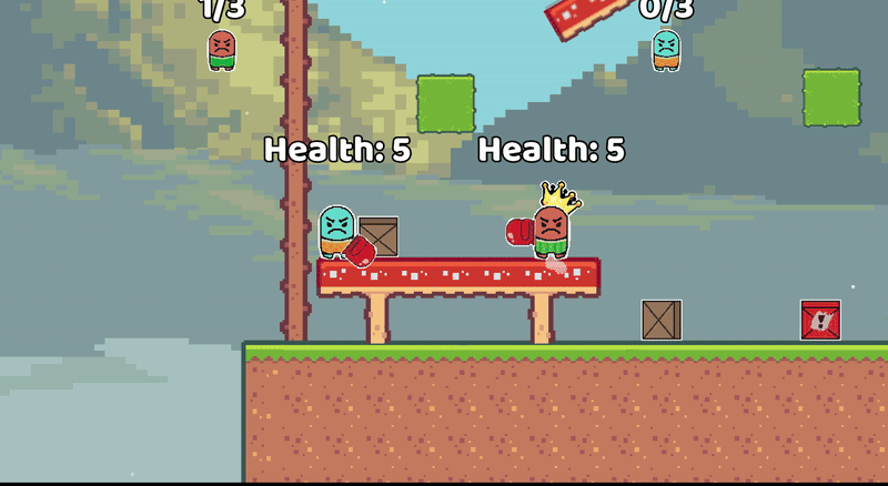
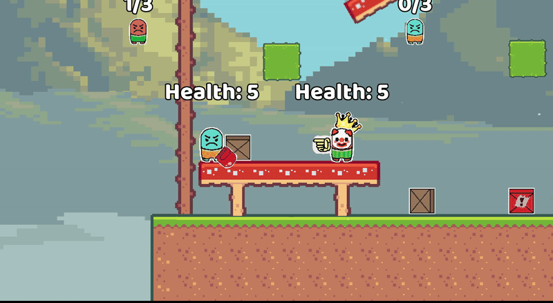
Diegetic Health Representation
I designed Knuckle Knockout’s facial expressions, bruising, and bandages to make damage feel personal and intuitive. Instead of a health bar, players read their character’s condition through shifting expressions and wear, reinforcing empathy, and impact.
✦
Process
Dynamic character expressions
【How could health feedback reduce visual clutter without sacrificing clarity?】
×
Removed the traditional health bar to declutter the screen and shifted damage feedback into character facial expressions and visible wear, allowing players to read health intuitively without competing UI elements pulling attention away from the action.
________ ✴ ________
Clear visual separation
【How could visual damage states stay readable during fast-paced matches?】
×
Observed how players naturally read character visuals during playtests and identified which facial cues, bruises, and bandages most clearly signaled danger, layering those elements to communicate damage at a glance.
________ ✴ ________
Readable over large screen space
【How could interpreting emotional clarity support gameplay without slowing players down?】
×
Iterated on the severity, timing, and visibility of damage states based on player reactions, ensuring the system conveyed empathy and impact while still supporting quick, confident decision-making.
________ ✴ ________
Emoji System
I designed Knuckle Knockout’s emoji system to encourage playful player expression beyond combat. To give players expressive moments mid-match, I implemented quick-trigger emotes like rock-paper-scissors that could be used without disrupting gameplay flow. Each emoji was exaggerated in form and timing to amplify emotion; triumph, frustration, and mock rage. Turning reactions into lightweight taunts that reinforced the game’s humor, energy, and shared chaos.
✦
Process
Four dynamic facial expressions
【How could players express emotion during matches without interrupting gameplay flow?】
×
Designed quick-access emotes that could be triggered mid-match, allowing players to communicate reactions and personality without pausing combat or breaking momentum.
________ ✴ ________

Four dynamic hand emotes
【How could the emoji system encourage playful taunting and social interaction between players?】
×
Separated emojis into face and hand systems, allowing players to mix and match expressions and gestures mid-match. This flexibility created more personalized, expressive taunts that naturally fueled couch-side verbal back-and-forth, reinforcing Knuckle Knockout’splayful competitiveness and social chaos.
________ ✴ ________
Sixteen total possible expressions
【How could expressive taunts stay playful instead of disruptive or toxic?】
×
Observed player behavior through playtesting and refined timing, frequency, and visual tone to balance humor and competitiveness, ensuring emojis reinforced playful rivalry without disrupting the social flow of matches.
________ ✴ ________